
티스토리 뷰
What's new in UIKit - WWDC22 - Videos - Apple Developer
본 글은 WWDC 를 보고, 번역 및 요약 그리고 실행해보는 스터디 프로젝트의 일환입니다.

UIKit 은 앱을 관통하는 강력한 프레임워크입니다. iOS 16 의 새로운 기능을 지원하기 위해 업데이트했습니다.
생산성을 위한 UI 개선, 컨트롤 개선 사항, API 개선 사항, UIKit 와 SwiftUI 를 함께 사용하는 방법에 대해서 이야기하겠습니다.

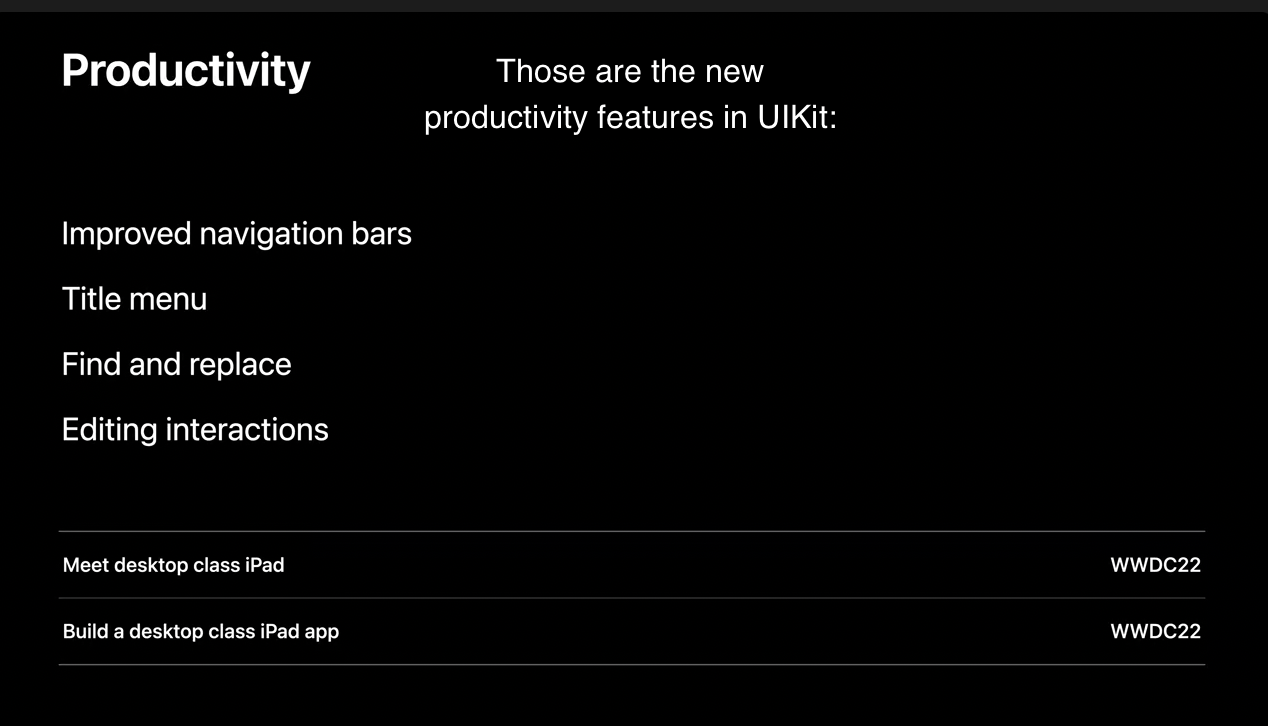
1. Productivity Improvements
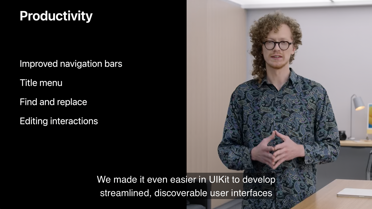
깔끔하고 눈에 띄는 사용자 인터페이스를 디벨롭하기 위해서 UIKit 에서 다음과 같은 것들을 쉽게하도록 만들었습니다.
- 개선된 navigation bar 와 새로운 title menu 의 기능
- find and replace
- cut, copy, paste 등의 편집 인터렉션 개선
1) navigation bar
먼저, 내비게이션 바를 살펴보겠습니다.
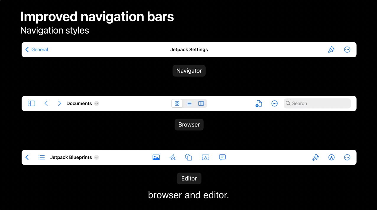
데스크톱 수준의 툴바 기능을 지원하기 위해 업데이트 했습니다. iOS 16의 UIKit은 Browser 와 Editor 를 통해서 문서 기반의 앱을 지원합니다.
- Browser : 웹과 문서 브라우저와 같은 히스토리나 폴더 구조를 이용하여 탐색하기에 적합합니다.
- Editor : 문서 편집을 고려해서 만든 인터페이스입니다.
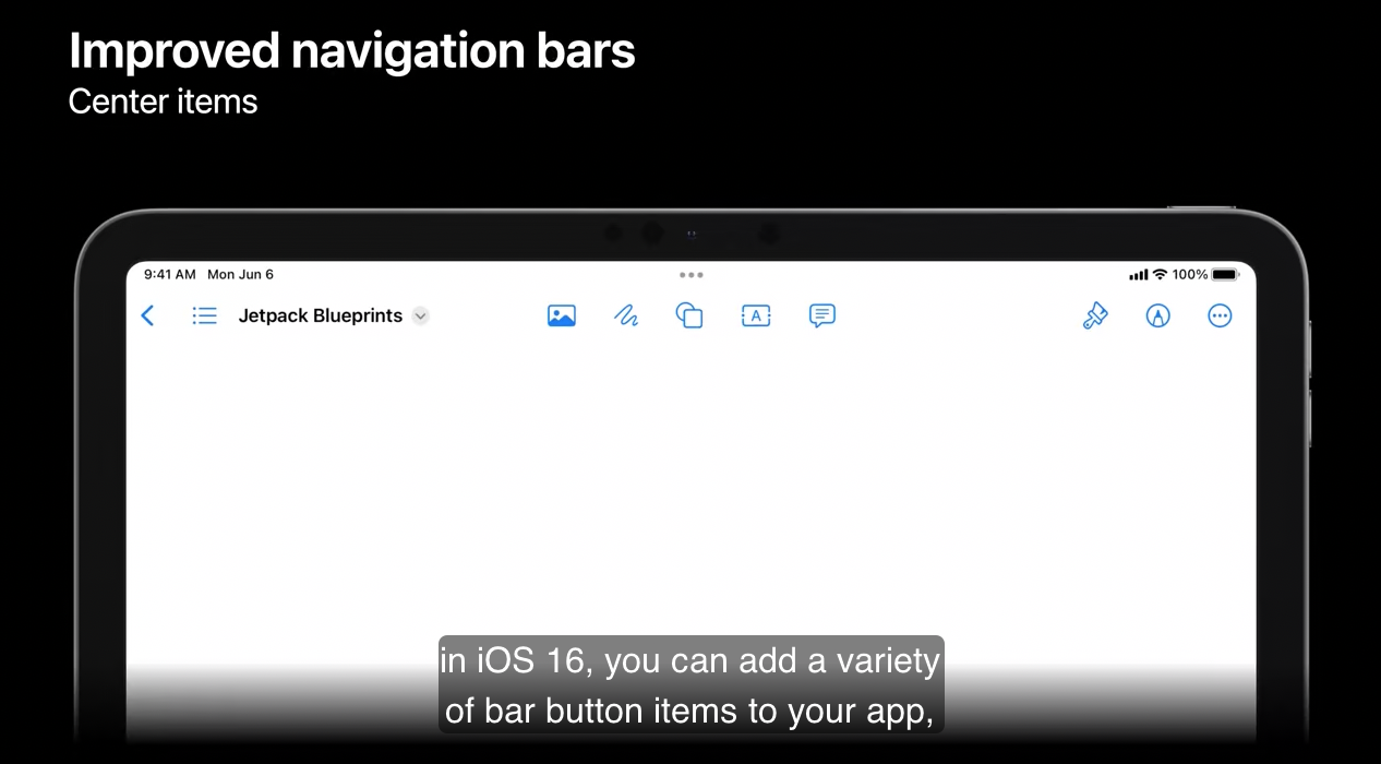
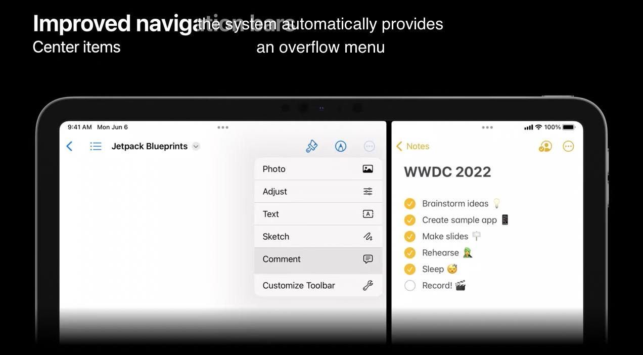
iOS 16에서는 앱에 bar button items 을 추가할 수 있습니다. 이것들은 navigation bar 의 정가운데에 배치됩니다.
Center Items
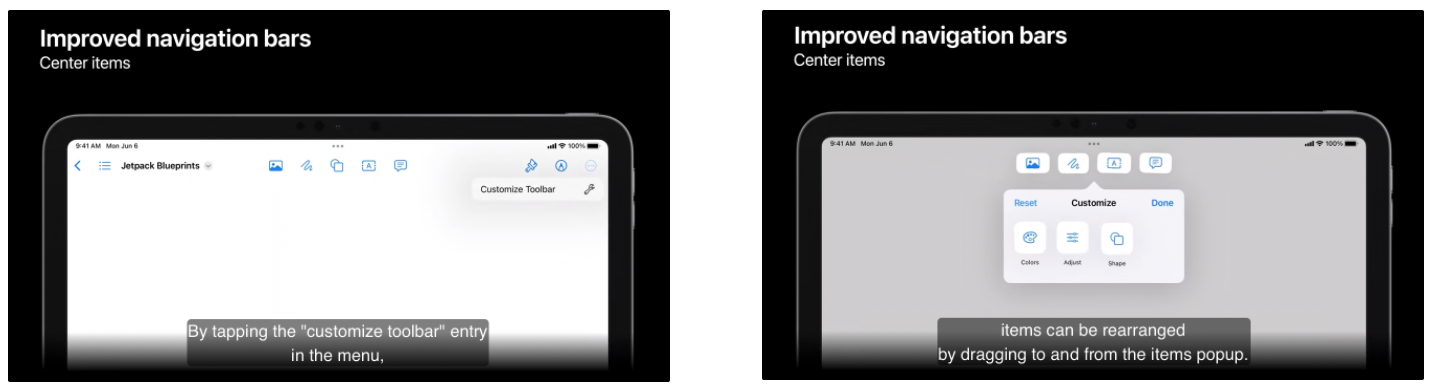
menu 에서 “Customize Toolbar” 를 탭하면 item 들을 popup 창에서 드래그하여 재배치 할 수 있습니다. 새로운 configuration 은 계속 유지됩니다.
side-by-side mode 를 실행하여 크기를 맞춰야하는 상황이 생기면 시스템은 자동으로 overflow menu 를 제공합니다.
2) Title Menu
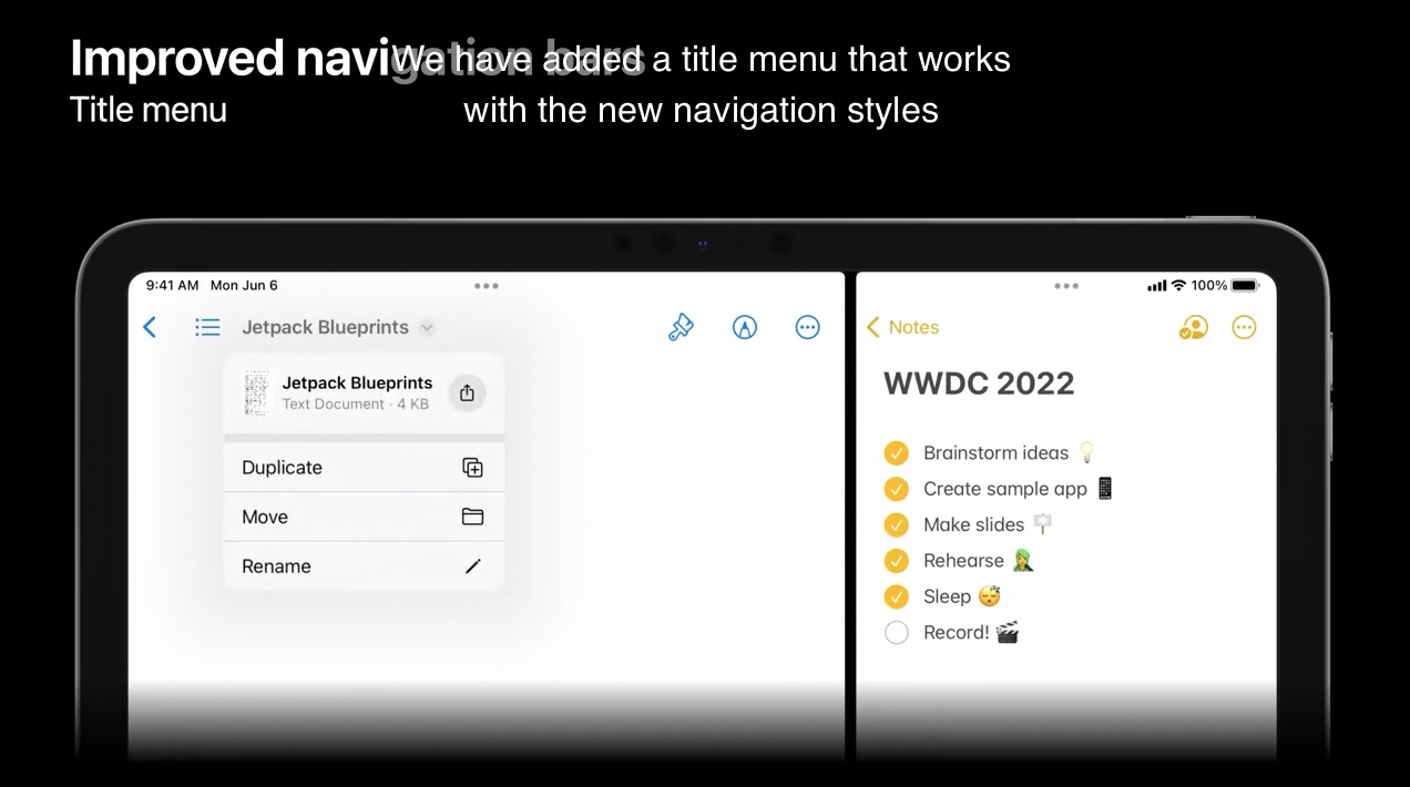
새로운 내비게이션 스타일에서 동작하는 타이틀 메뉴를 추가하여 몇 가지 기능을 지원합니다.
- Duplicate
- Move
- Rename
- export
이런 항목들은 대응하는 delegate 메서드를 적용하여 구현할 수 있습니다.
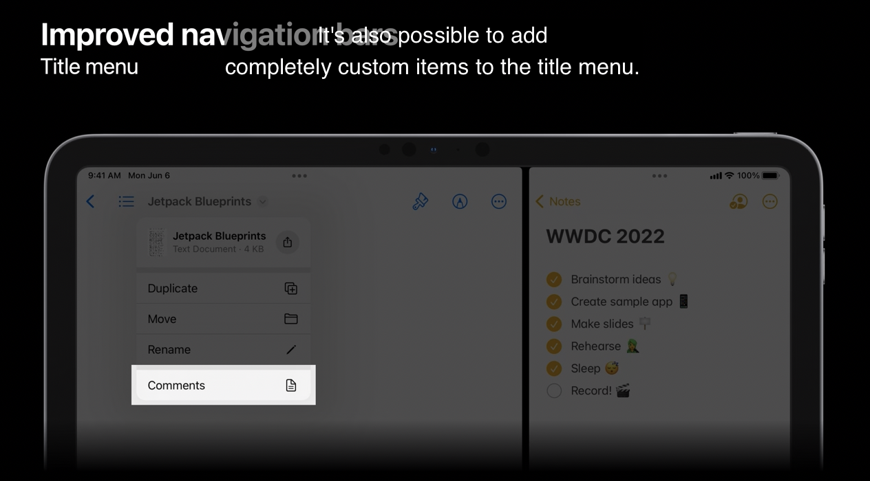
그리고 title menu 에 커스텀 아이템을 추가할 수도 있습니다.
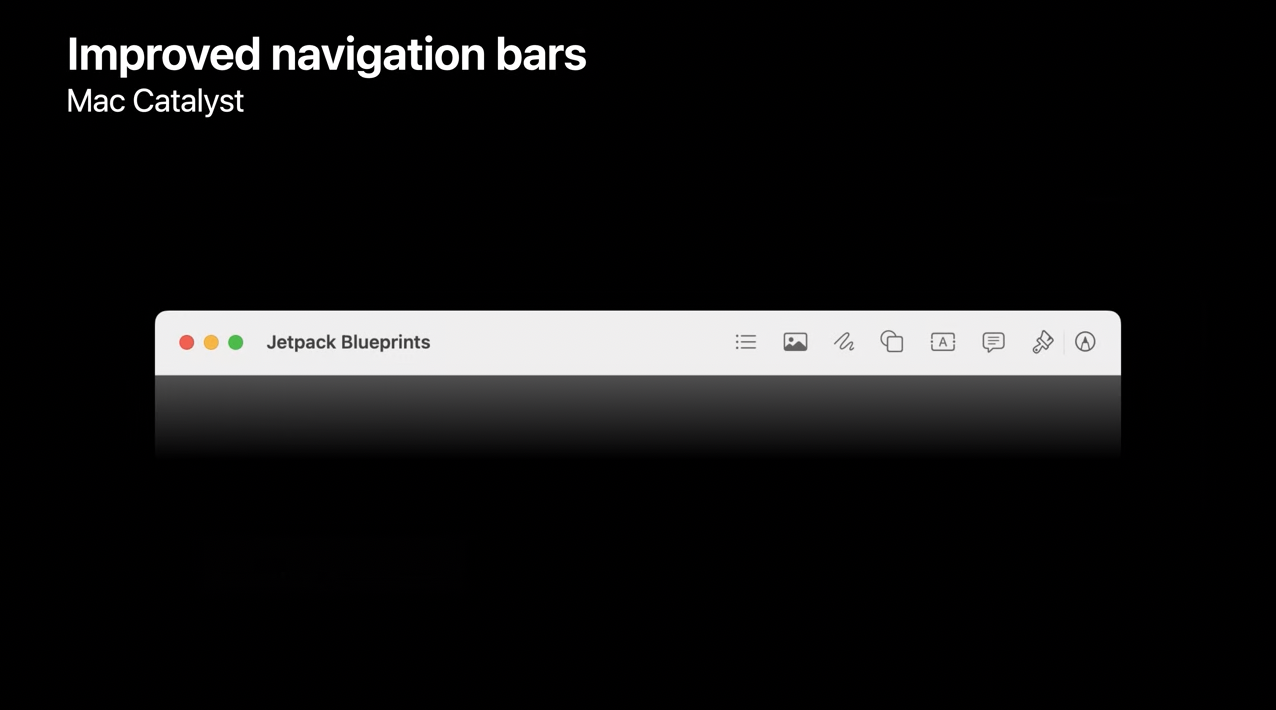
Mac Catalyst
Mac Catalyst 로 빌드한 앱은 개선된 내비게이션 바를 이용할 수 있습니다. 이는 NSToolbar 와 매끄럽게 통합되며 추가적인 코드가 필요하지 않습니다.
3) Find and replace
iOS 16 은 여러 앱에 걸쳐 텍스트를 편집하는 방법을 도입했습니다.
첫 번째는 새롭게 바뀐 Find and replace 입니다.
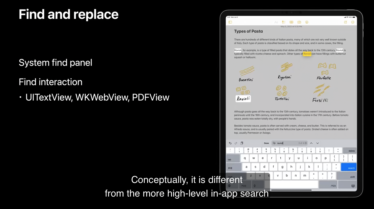
개념적으로는 data model objects 로 운영되는 사진이나 캘린더 이벤트와 같은 높은 수준의 in-app search 와 다릅니다. 대신에 find and replace 는 텍스트에 맞게 설계되었습니다.
UITextView 와 WKWebView 와 같은 built-in UIKit 뷰에서 flag 를 설정하면 이 기능을 활성화할 수 있습니다.
추가적으로 이 기능을 적용한 여러 뷰와 문서에서 매끄럽게 작동합니다.
4) Editing Interactions
다음은 대규모 업그레이드가 된 edit menu 입니다.
이제 input method 에 따라서 다르게 보입니다. touch interaction 에서는 훨씬 상호작용적으로 재디자인된 menu 를 갖게 되었습니다.
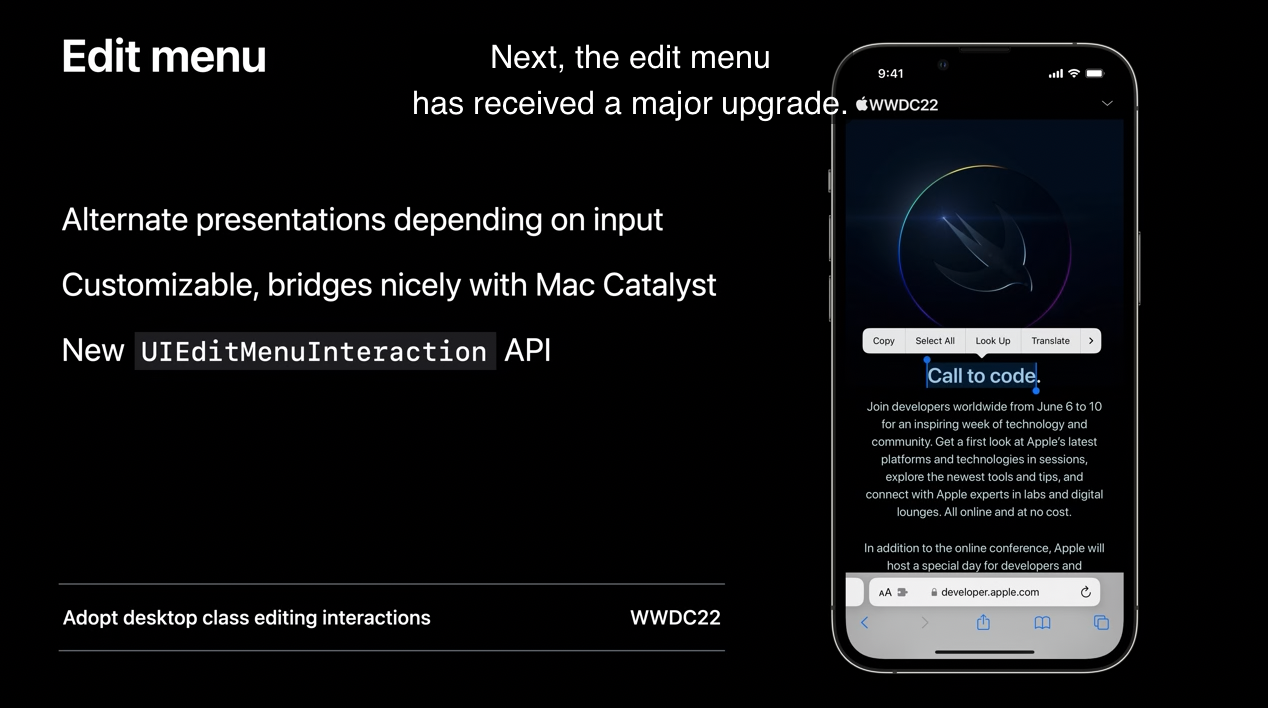
포인터를 사용할 때는 모든 기능이 들어있는 context menu 가 등장합니다. 이러한 두 경험을 매끄럽게 제공하기 위해서 UIEditMenuInteraction 을 도입하여 이제는 deprecated 된 UIMenuController 를 대체합니다.
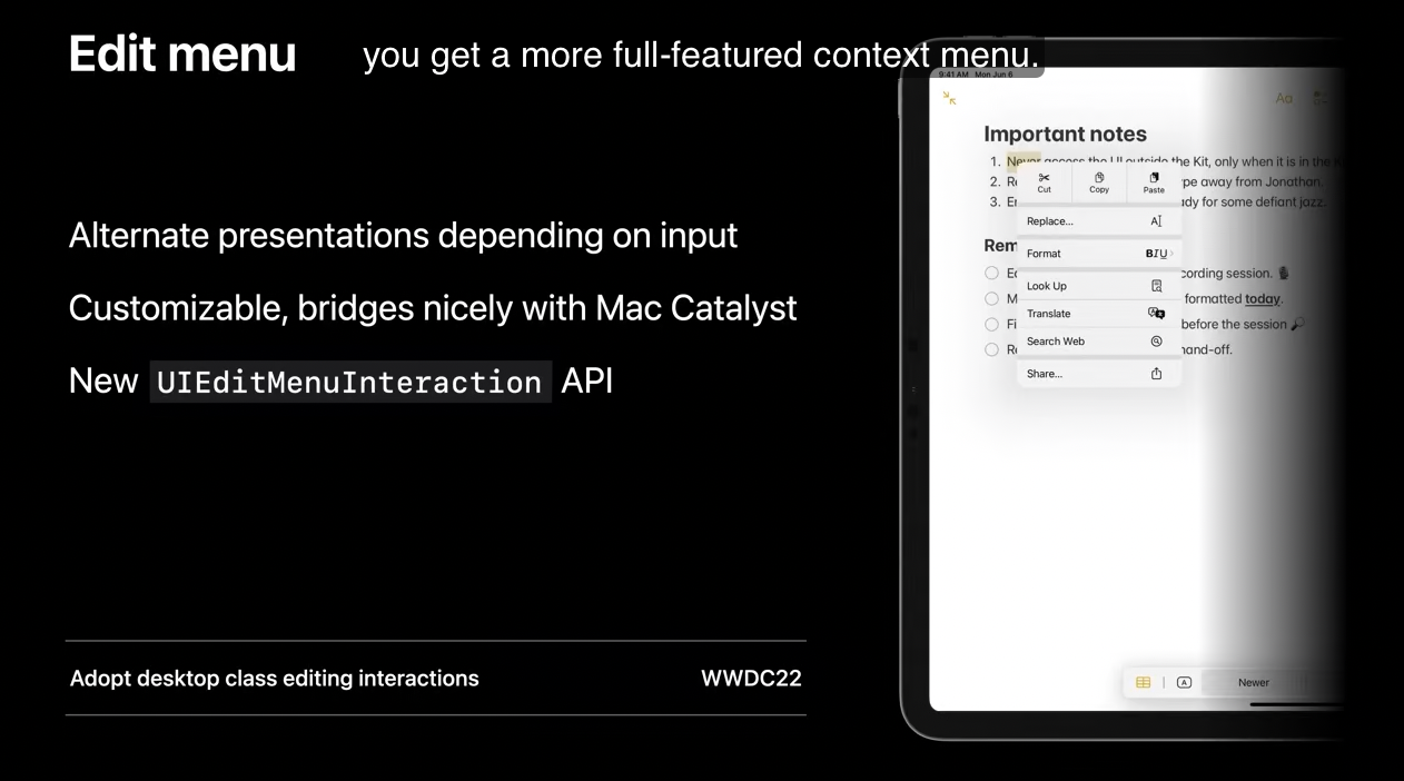
또한, text view 의 메뉴에 actions 을 삽입하는 새로운 API 도 생겼습니다. 아래의 세션을 통해서 새로운 edit menu 의 자세한 사항과 커스텀 뷰에서 find 인터렉션을 적용하는 법을 알아볼 수 있습니다.
Additionally
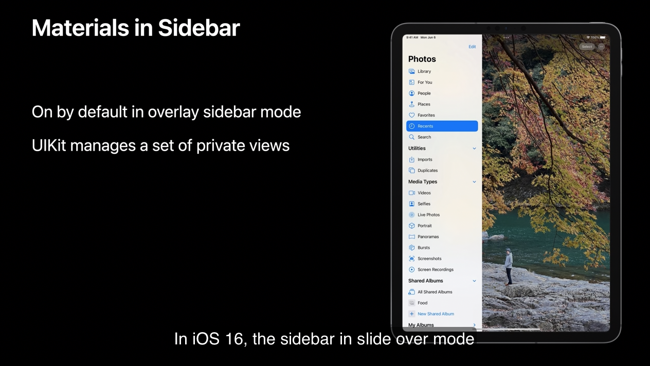
제가 다루고 싶은 시각적인 UI 업데이트 사항이 있습니다.
iOS 16에서 slide over 모드의 사이드바는 추가 코드가 없어도 활성화 됩니다. 이를 달성하기 위해서 UIKit 은 몇 가지 private views 를 관리합니다.
다음은 지금까지 알아보았던 UIKit 에서 새롭게 제공하는 기능들입니다.
오늘의 세션에서는 기본적인 내용만 다루었습니다. 더 많이 알아보기 위해서 세션들을 통해 확인할 수 있습니다.
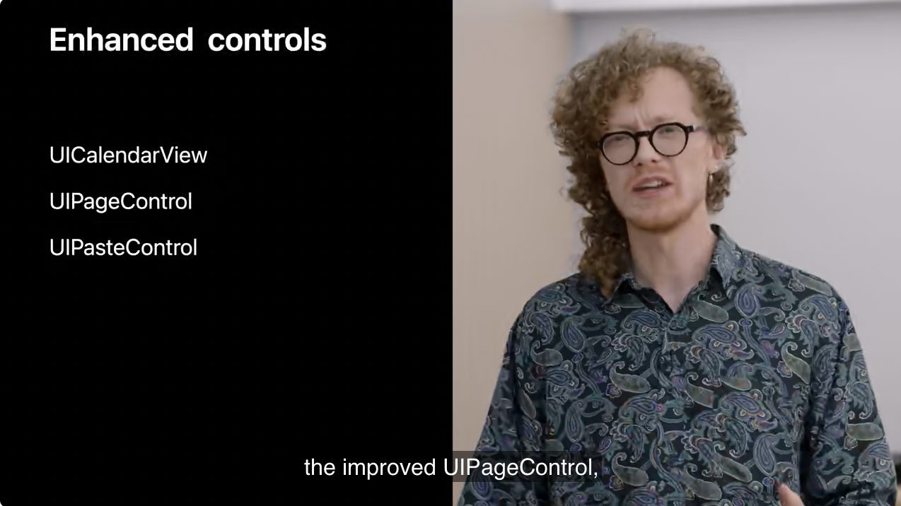
2. Control enhancements
이제 추가한 두 가지 새로운 control 을 소개하고, UIPageControl 의 개선 사항을 논의하겠습니다.
1) UICanlendarView
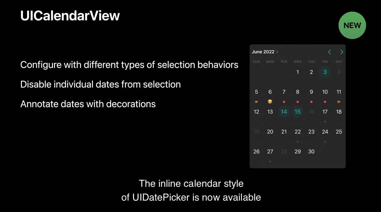
이제 UIDatePicker 의 inline calendar style 을 모든 기능이 있는 독립적인 요소로 UICalendarview 의 형태로 사용할 수 있습니다.
UICalendarView 는 다양한 타입의 선택 동작을 지원합니다. 선택적인 단일 날짜나 여러 날짜의 선택이 가능합니다. 사용 가능한 날짜 범위 설정은 물론 선택 범위에서 일부 날짜를 제외하는 기능도 있습니다. 또한, 각 날짜를 annotate 할 수도 있습니다.(= 장식할 수도 있습니다.)
UICalendarView 와 UIDatePicker 의 중요한 차이점 한 개는 UICalendarView 가 날짜를 표현할 때는 NSDate 가 아닌 NSDateComponents 로 나타냅니다. NSDate 와 달리 NSDateComponents 는 특정 날짜를 더 정확하게 나타내지만 NSDate 는 시간의 한 포인트를 나타냅니다.
NSDateComponents 는 매우 유연하므로 어떤 NSCalendar 를 사용하는지 명확하게 명시해야 합니다.
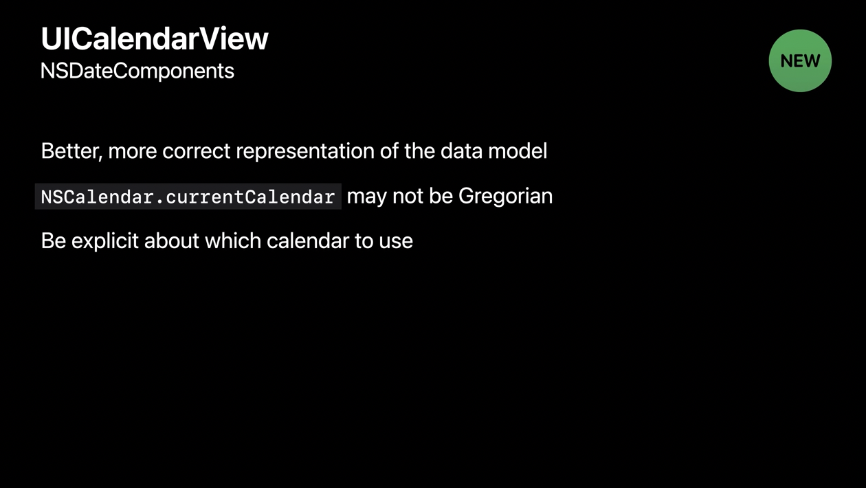
현재 캘린더 타입에 관해 가정하면 안 됩니다. 그레고리력으로 달력을 설정해야한다면 gregorian 이라고 명시해야 합니다.
Configure calendar view
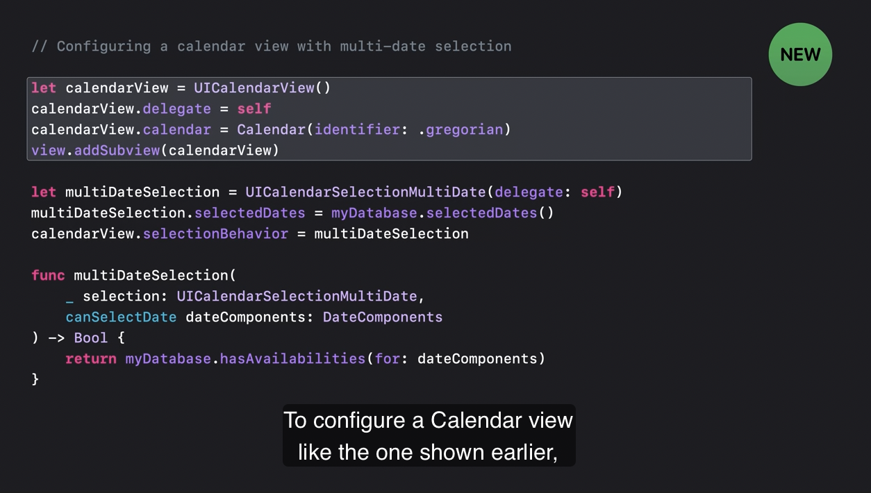
이전에 보았던 캘린더 뷰처럼 설정하려면 먼저 Calendar view 를 생성하고 delegate 를 설정합니다. 캘린더를 Gregorian NScalendar 로 정하기 위해서 calendarView 의 calendar 프로퍼티를 설정해줍니다.
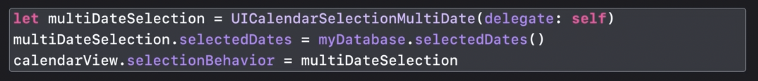
다음은 multi-date 설정하기 위해서 UICalendarSelectionMultiDate 객체를 만들고, selectedDates 프로퍼티를 여러분의 data model 에 있는 기존 날짜에 설정하여(=myDatabase.selectedDates()) 캘린더 뷰에 나타나게 할 수 있습니다.
그리고 selectionBehavior 에 selection object 를 설정하세요.
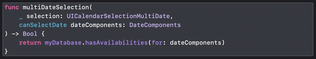
캘린더의 개별 날짜의 선택을 막기 위해서 calendar 의 selection’s delegate 로 부터 multiDateSelection:canSelectDate: 메서드를 적용하여 선택할 수 있는 날짜를 제어할 수 있습니다.
선택할 수 없는 날짜는 calendar view 에서 회색으로 표시될 것입니다.
(hasAvailabilities(for:) 메서드는 DateComponents 매개변수가 선택할 수 있는지 제어합니다.)
Configure decorations
개별 날짜에 decorations 을 달고 싶다면 calendar delegate 에서 calendarView:decorationForDateComponents: 를 적용하면 됩니다.
(eventType(on:)메서드는 DateComponents 매개변수가 어떤 이벤트 타입인지 제어합니다.)
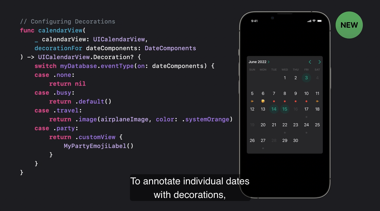
- decorations 이 없으면 nil 을 반환합니다.
- default 를 반환하면 기본값인 회색 원이 설정됩니다.
- 색상을 커스텀하여 image 장식도 생성할 수 있습니다.
- 필요하다면 커스텀 뷰를 반환할 수도 있습니다.
커스텀 뷰 decoration 은 interaction 을 허용하지 않으며 공간에 고정되어 있다는 점을 주의해 주세요.
2) UIPageControl
UIPageControl 도 개선되었습니다.
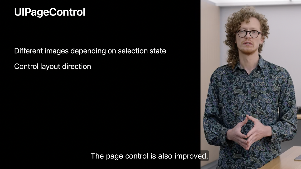
현재 페이지에 커스텀 indicator 이미지를 추가하여 페이지의 선택 여부에 따른 다른 이미지를 선택할 수 있습니다. 이제 page control 의 direction(이동방향) 이나 orientation(고정된 상황에서의 방위)을 완벽하게 커스텀할 수 있게 되었습니다.
여기 vertical page control 을 설정하는 예시가 있습니다.
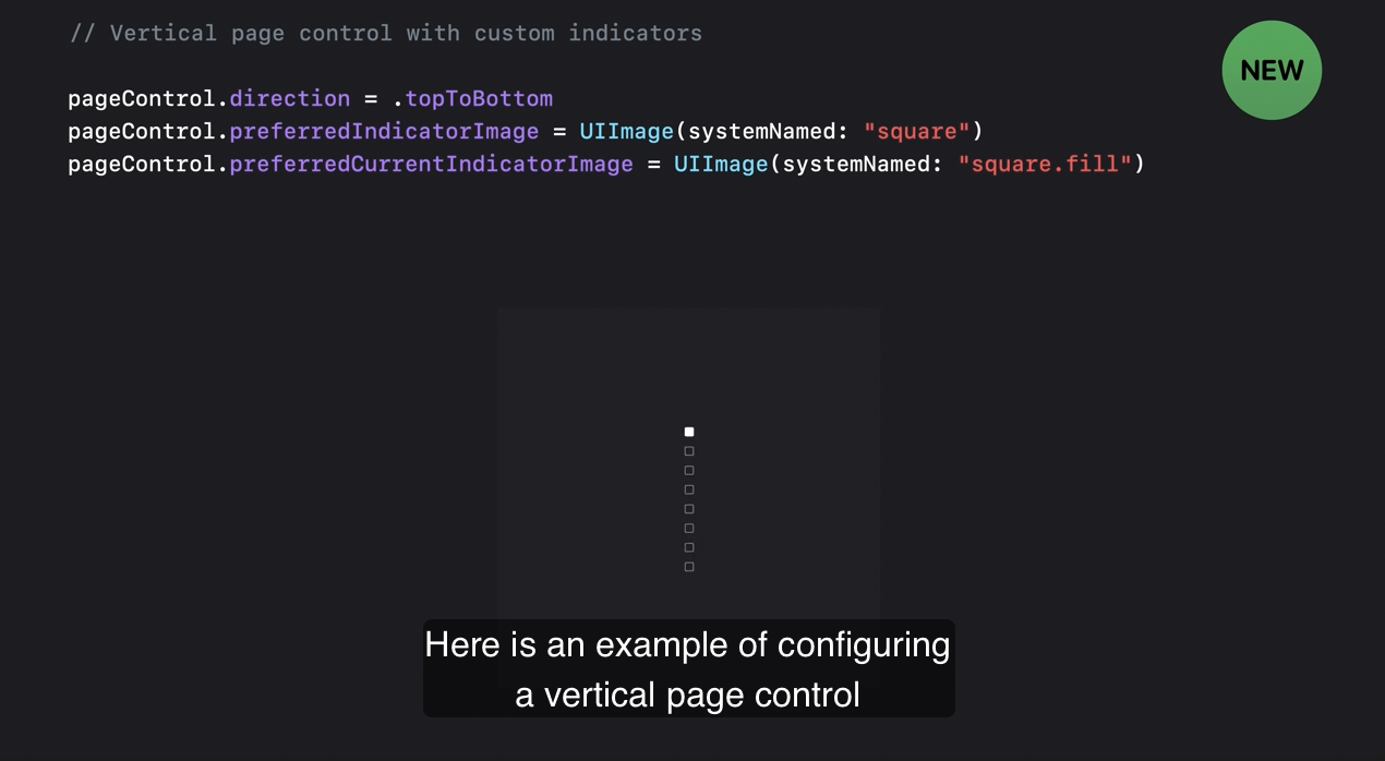
현재와 현재가 아닌 페이지에서 인디케이터가 바뀝니다. page control 의 direction 을 top to bottom 으로 설정하면 끝입니다.
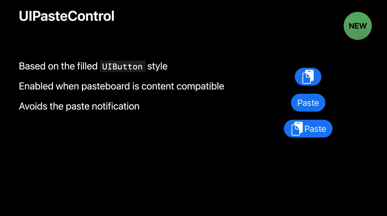
3) UIPasteControl
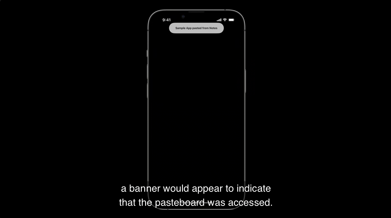
Apple 은 사용자 개인 정보와 보안을 지키려고 노력합니다. iOS 15에서는 앱이 프로그래밍적으로 system 이 제공하는 Pste interfasces 를 통하지 않고 pasteboard 에 접근하면 pasteboard 에 접근했다는 배너가 나타났습니다.
iOS 16 에서는 시스템 동작이 변경되었습니다. 이제는 배너 대신 pasteboard 의 사용 허가를 묻는 알림창이 나타납니다.
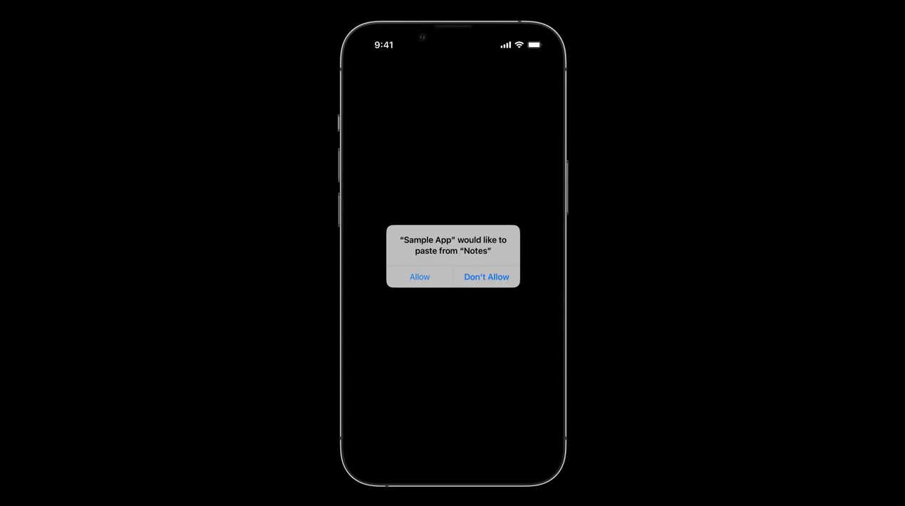
사용자가 system 의 paste interface 를 사용하면 pasteboard 에 대한 암묵적인 액세스를 제공하여 alert 창을 피할 수 있습니다.
(paste interface : edit menu 등에서 copy 할 때 alert 창 피함. pasteboard : 제스처(손가락 세 개 모으기)를 통해서 복사. 이때는 배너 등장)
만약, cutom paste controls 가 있다면 새로운 UIPasteControl 로 대체할 수 있습니다. 이것은 UIButton 와 모습과 동작이 비슷합니다.
지금까지 UICalendarView 와 개선된 UIPageControl 보안 중심의 UIPasteControl 을 알아봤습니다.
이제, API 개선 사항을 짚어드리겠습니다.
3. API refinements
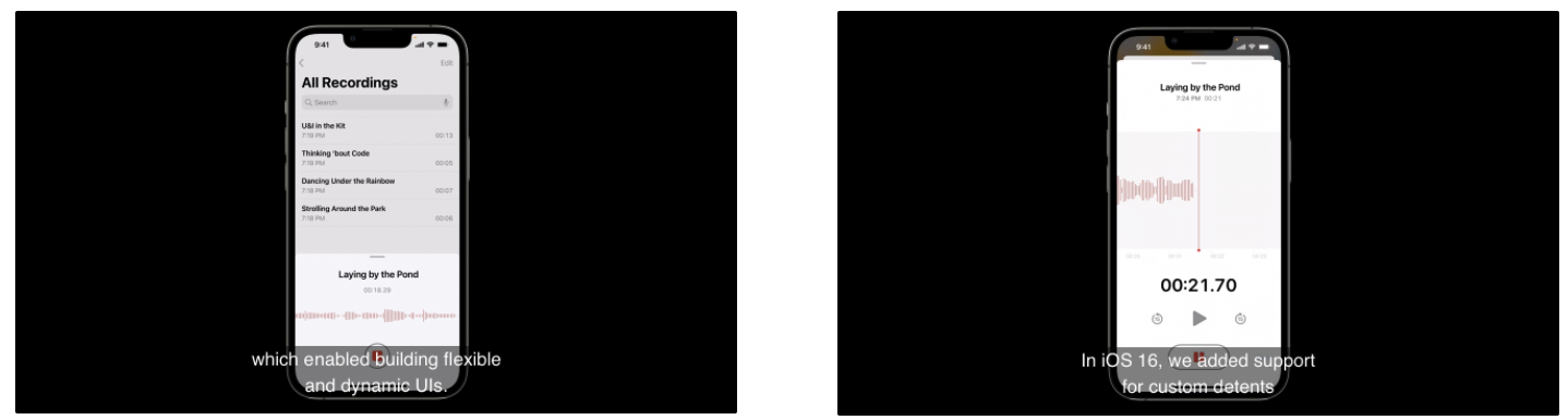
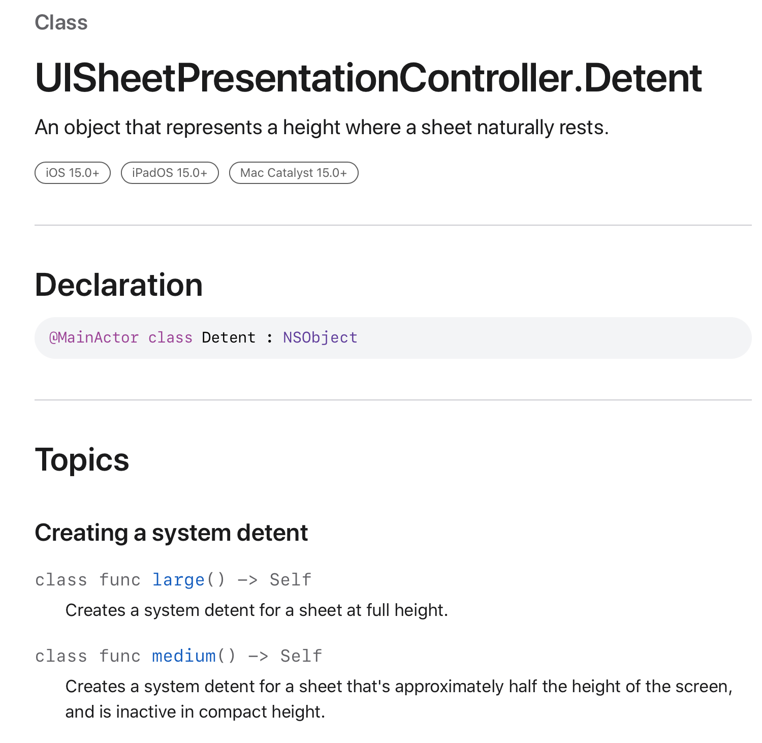
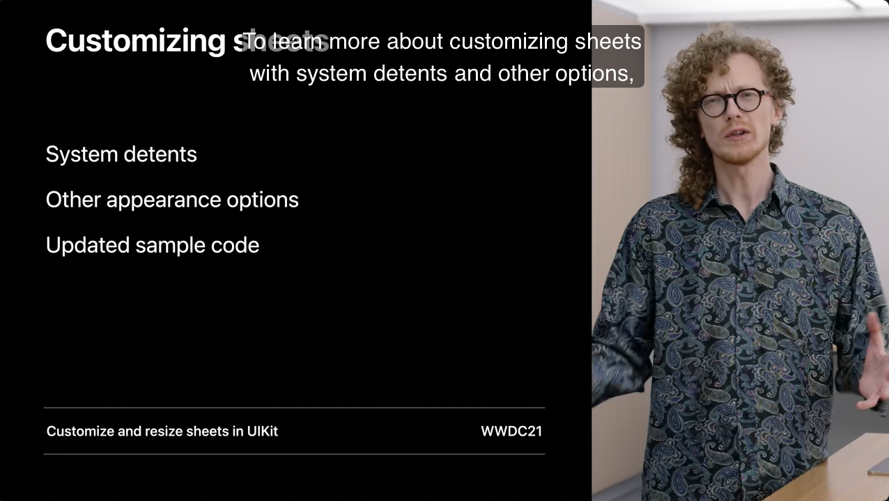
1)Customizing Sheets
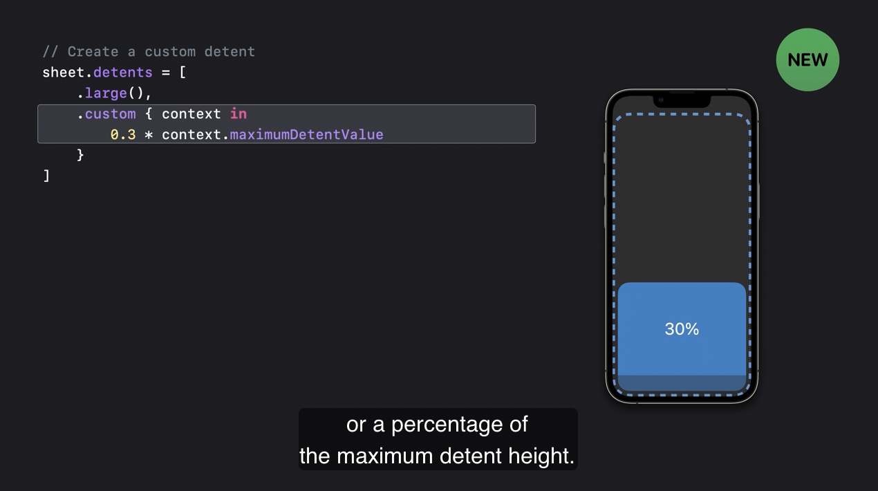
iOS 15에서는 sheet 에 detent 를 추가하여 유연하고 역동적인 UI 를 구축할 수 있었습니다. iOS 16에서는 커스텀 detents 를 지원하여 sheet 를 마음대로 조절할 수 있습니다.
Detent?
이 기능을 활용하려면 .custom detent 를 사용하여 관련된 block 에서 시트의 높이를 지정할 수 있습니다.
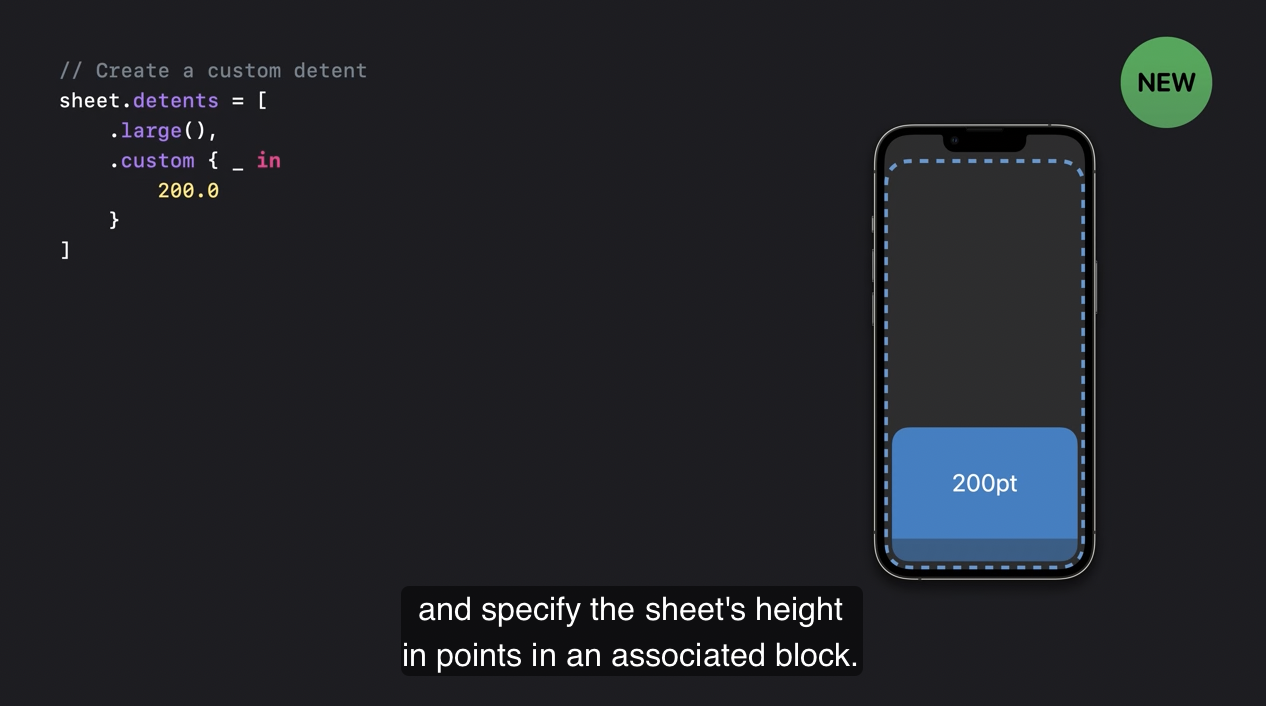
constant value 를 반환해도 되고, detent 의 최대 높이의 비율을 반환해도 됩니다.
@MainActor static func custom(
    identifier: UISheetPresentationController.Detent.Identifier? = nil,
    resolver: @escaping (_ context: UISheetPresentationControllerDetentResolutionContext) -> CGFloat?
) -> UISheetPresentationController.Detent
다른 API 를 참조해야 한다면 custom detent 에 식별자를 줄 수도 있습니다.
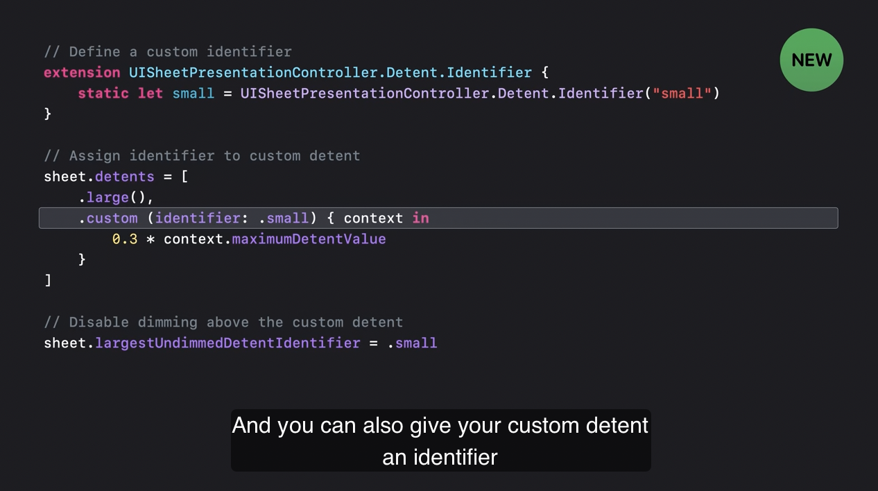
예를 들어 식별자를 사용하여 custom detent 에서 dimming 을 비활성화할 수 있습니다.
(기본값은 nil 이고, 설정한 detent 보다 큰 detent 에만 dimming view 를 추가하려면 이 프로퍼티를 설정하면 됩니다.)
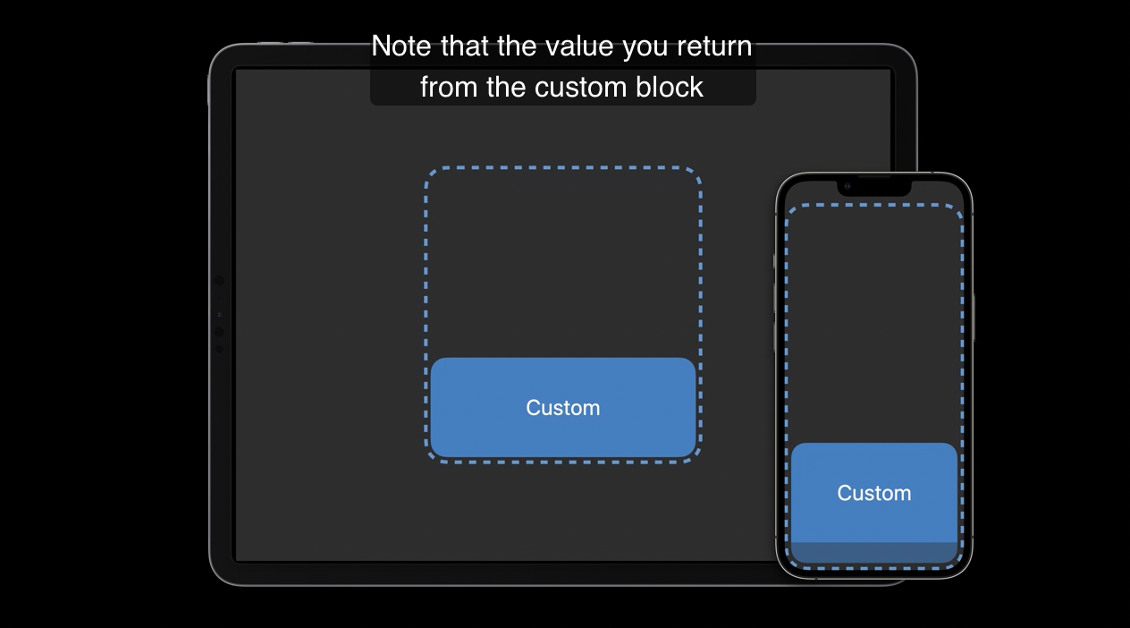
custom block 으로부터 반환하는 값은 bottom safe area inset 을 고려하지 않습니다. floating 과 edge-attached sheets 에서도 동일하게 계산됩니다.
위의 설정에 관해서는 해당 세션을 참고하면 됩니다.
2) SF Symbool
SF Symbol 에서도 새로운 기능이 있습니다. sybol 은 4가지 랜더링 모드를 지원합니다.
- Monochrome, Multicolor, Hierarchical, Palette
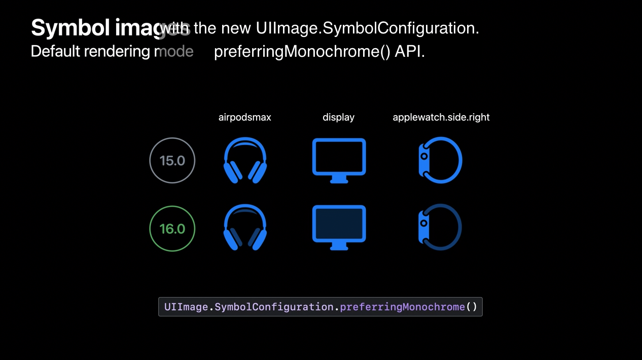
UIKit 은 기본적으로 Monochrome 을 지원합니다. iOS 16에서 UIKit 은 symbol 을 렌더링할 때 렌더링 모드가 지정되지 않은 경우 모노크롬이 아닌 모드를 사용할 수 있습니다.

iOS 15에서는 렌더링 모드를 지정하지 않았을 때 모노크롬 렌더링을 사용했습니다. iOS 16에서는 이런 symbol 들의 기본값은 gierarchical rendaring 입니다.
일반적으로 심벌의 기본적인 렌더링 모드는 심벌을 표시하는 선호 방식입니다. 그래서 위의 경우에는 기본값으로 gierarchical rendaring 을 허용합니다. 하지만, monochrome rendering 을 명시적으로 요청할때는
UIImage.SymbolConfiguration.preferringMonochorme()을 사용합니다.
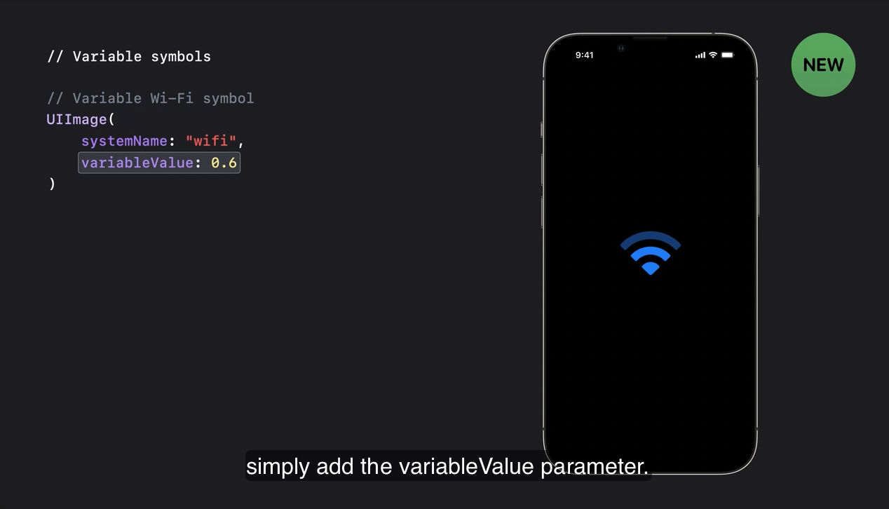
UIKit 은 variable symbol 지원하면서 0과 1사이의 값에 따라심벌의 변화를 나타낼 수 있습니다. 현재 볼륨의 레벨을 심벌로 표현한다고 해보겠습니다. 앱은 speaker.3.wave.fill 심벌을 사용할 수 있는데 variable rendering 을 지원하도록 업데이트 되었습니다.
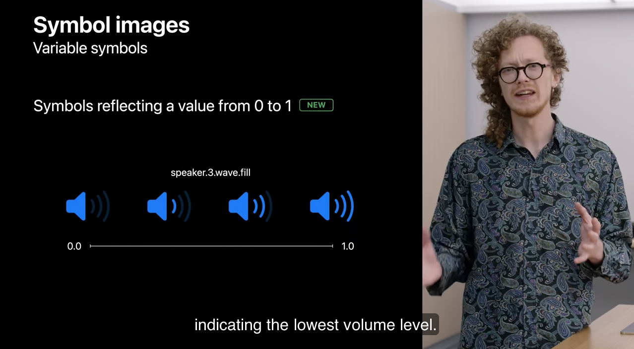
0일때는 speaker wave 를 흐리게하여 가장 낮은 볼륨 레벨을 표현합니다. 값이 1로 증가할수록 wave 가 점점 채워지면서 더 높은 볼륨 레벨을 표현합니다.
만약 심벌이 variable rendering 을 지원한다면, 앱들은 0과 1 사이의 값을 반영한 심벌을 앱에서 요청할 수 있습니다. variable symbols 를 사용하면 직관적입니다.
일반적인 non-variable symbol 는 UIImage 에 있는 SF Symbol API 로 얻을 수 있습니다.
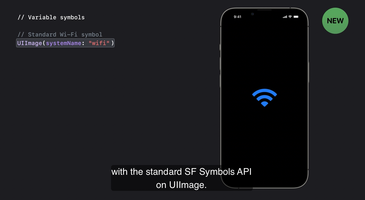
variable 값을 가지는 심벌의 버전을 얻기 위해서 variableValue 파라미터를 간단하게 추가할 수 있습니다.
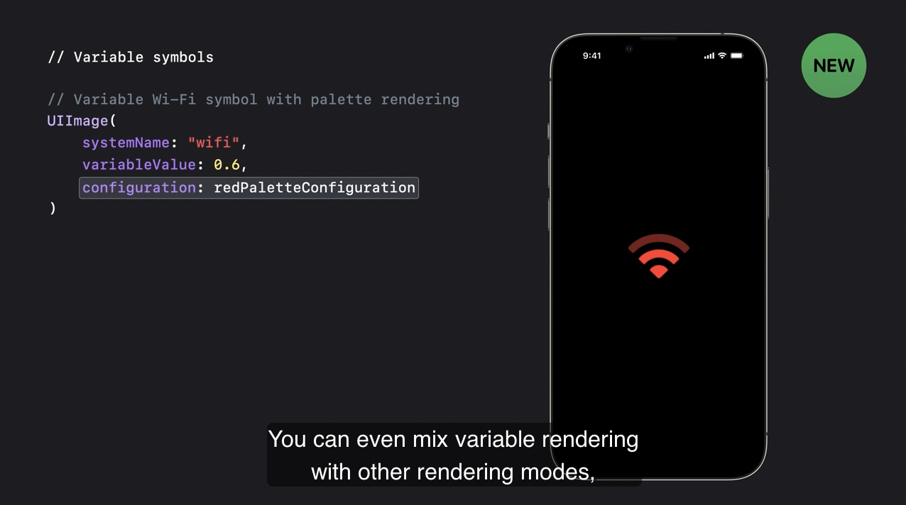
variable rendering 과 다른 렌더링 모드를 섞을 수도 있습니다. 예를 들어 palette 모드로 심벌을 꾸밀 수 있습니다.
많은 시스템 심벌들이 이제 variable rendering 을 지원하며 앱들은 custom symbol 을 업데이트하며 다양성을 지원할 수도 있습니다.
custom variable symbol 을 만드는 법이 궁금하시면 위의 세션을 통해 알아볼 수 있습니다.
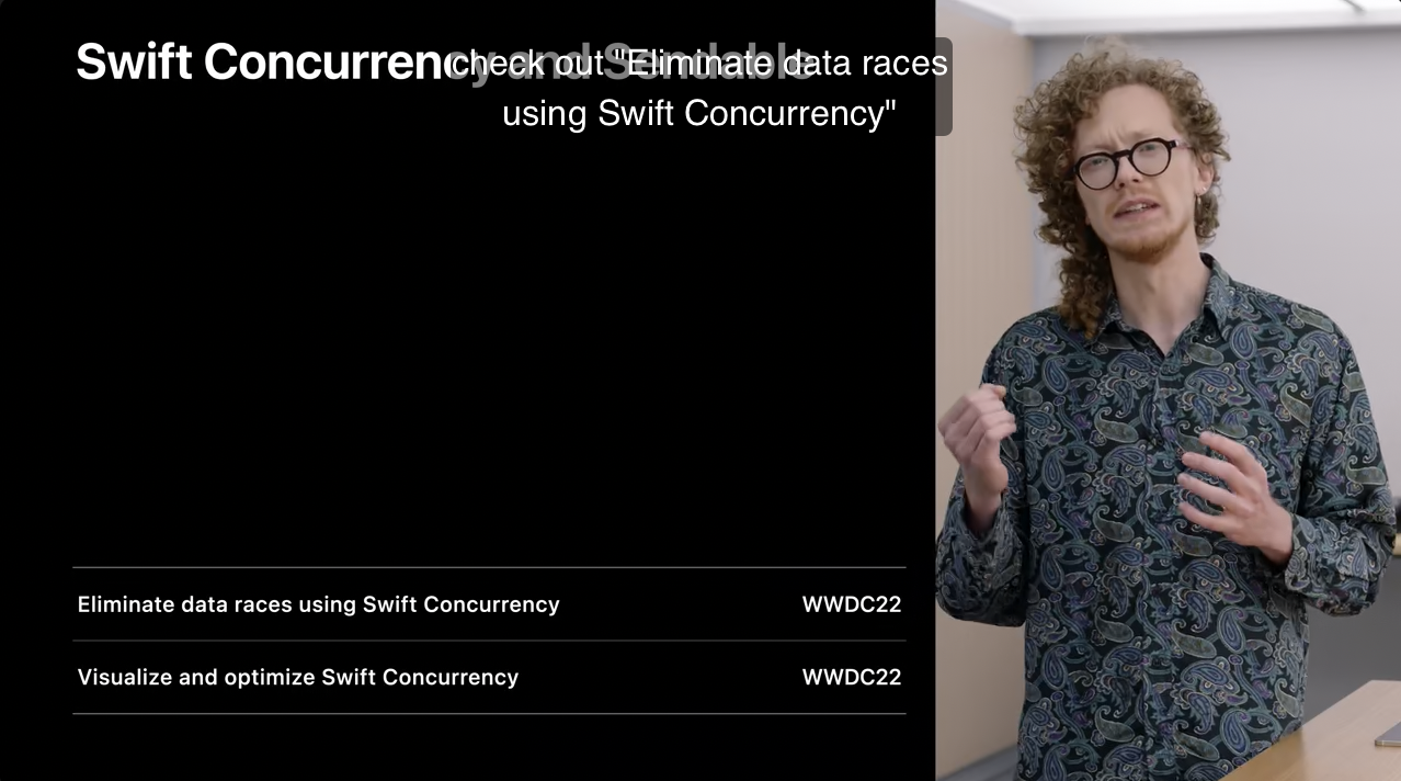
3) Swift Concurrency and Sendable
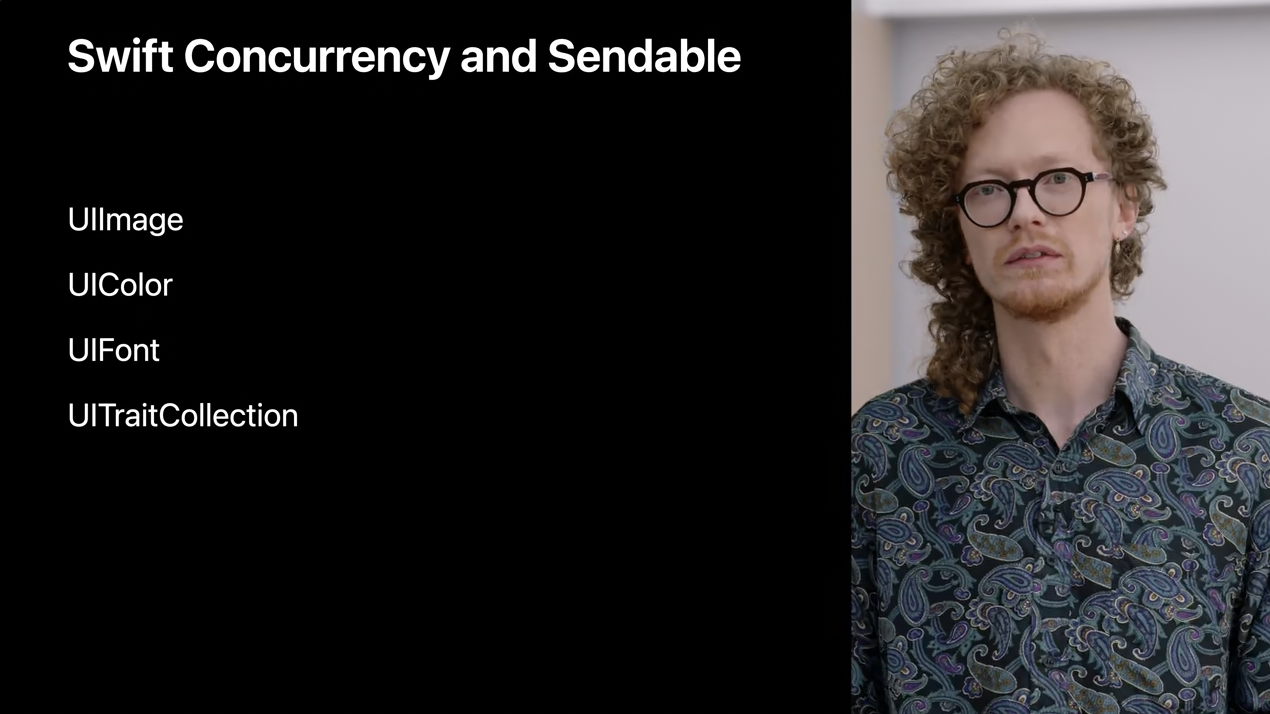
UIKit 을 새로운 Swift concurrency 기능에 맞춰서 개선했는데 UIImage 와 UIColor 와 같은 immutable(불변) types 을 Sendable 을 준수하는 것을 포함하여 MainActor 와 custom Actor 사이에서 컴파일러의 경고 없이 전송이 가능합니다.
예를 들어, Processor 라는 costom actor 와 ImageViewer 라는 뷰 컨트롤러가 있는데 이는 잠재적으로 MainActor 에 바운딩 되어 있습니다.
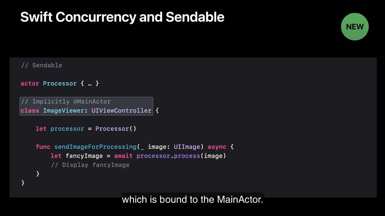
sendImageForProcessing 메서드 안에서 ImageViewer 가 Processor actor 에 처리를 위해서 이미지를 보내서 반짝이나 무지개 등을 추가할 수 있게 됩니다.
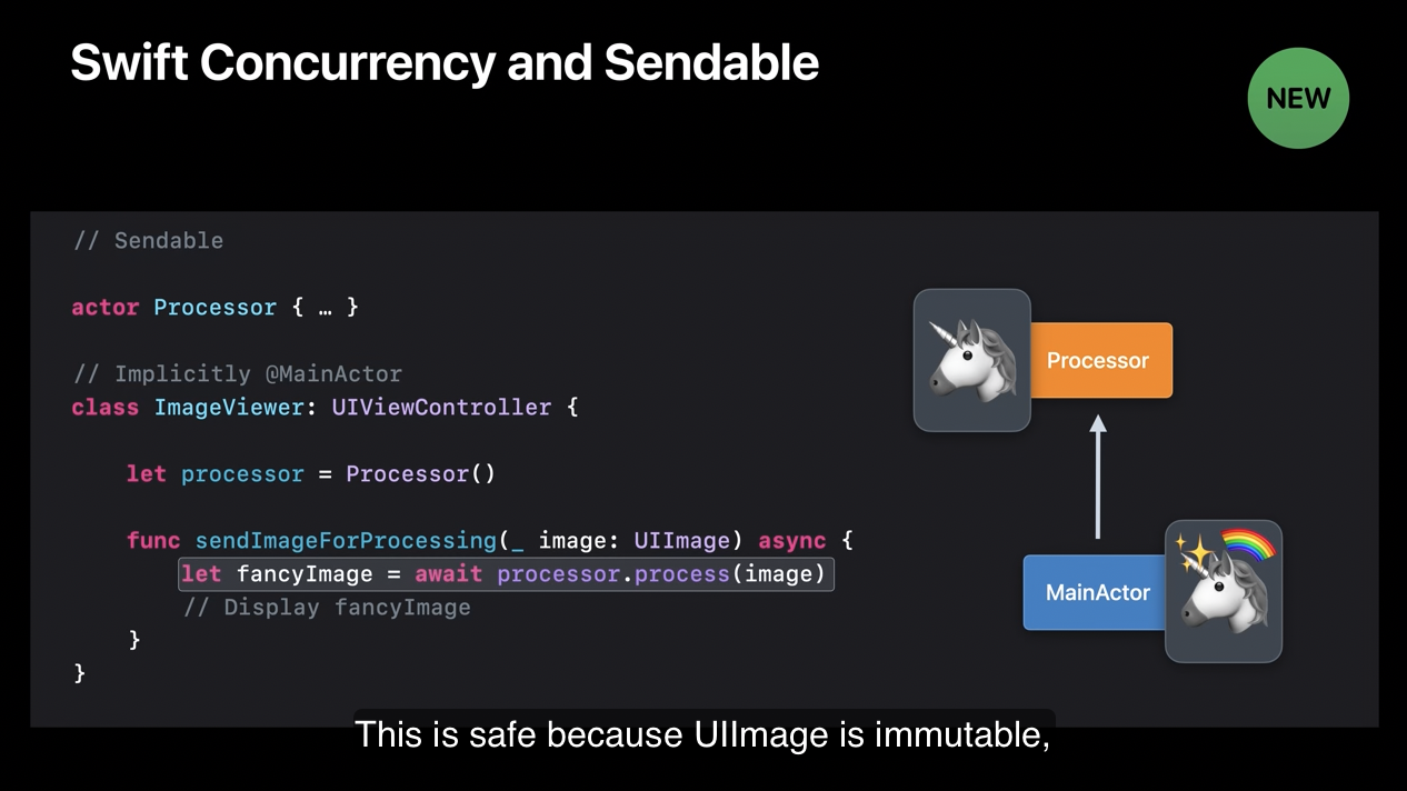
UIImage 가 immutable type 이므로 안전하며 Processor 가 새로운 복사본을 만들어서 반짝이나 무지개 등을 추가할 수 있습니다.
original image 에 대한 참조하는 모든 코드는 이런 수정 사항을 나타내지 않으며 공유 상태는 불안전하게 변화되지 않습니다.
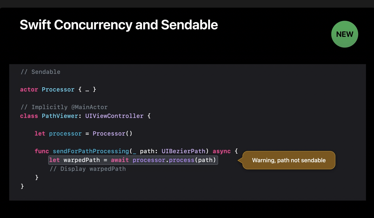
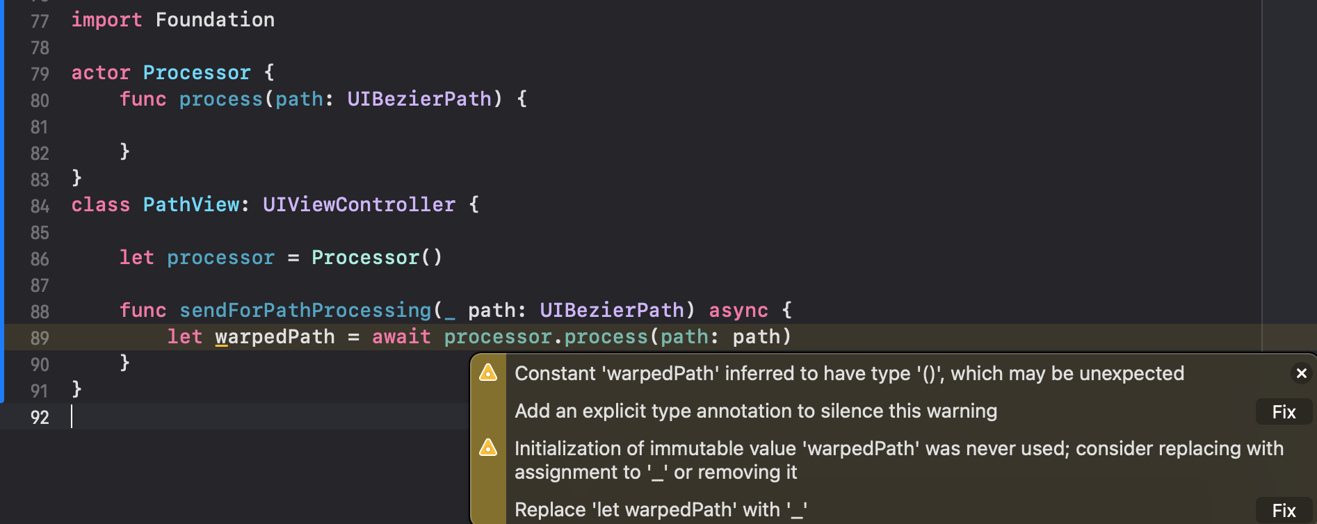
반면에 UIBezierPath 는 mutable 이기 때문에 Sendable 할 수 없습니다. 이전에는 documentation 로만 표현할 수 있었던 것은 컴파일러로 확인할 수 있으면 얼마나 멋질까요?
- iOS 15
- iOS 16
컴파일러가 확인할 수 있게 되었다.
Sendable 과 Swift Concurrency 에 관해 더 알고 싶다면 아래의 세션을 통해 알 수 있습니다.
3) Stage Manager
iOS 16은 external displays 를 위해 강력한 기능을 지원합니다. 또한, 이 기능을 얻기 위해 앱을 업데이트하지 않아도 됩니다. UIScreen API 를 사용하는 경우는 제외합니다.
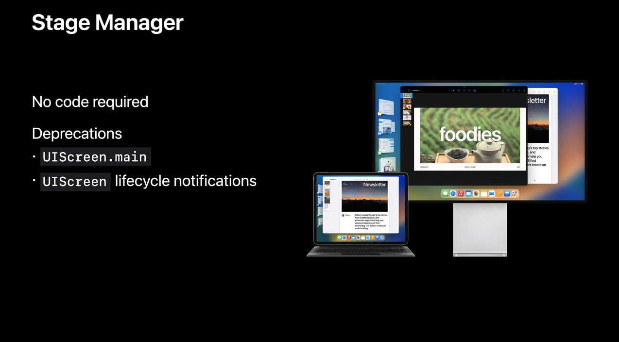
이제 더이상 앱에 main screen 이 있다고 가정하지 않아도 됩니다. 대신 더 trait collection 과 UIScene API 들과 같은 구체적은 API 들을 따르며 원하는 정보를 얻을 수 있습니다. 만약 여러분의 앱이 아직 UIScene 을 사용하지 않고 있다면, 업그레이드를 하지 않을 이유가 없고 multiple windows 를 지원하세요.
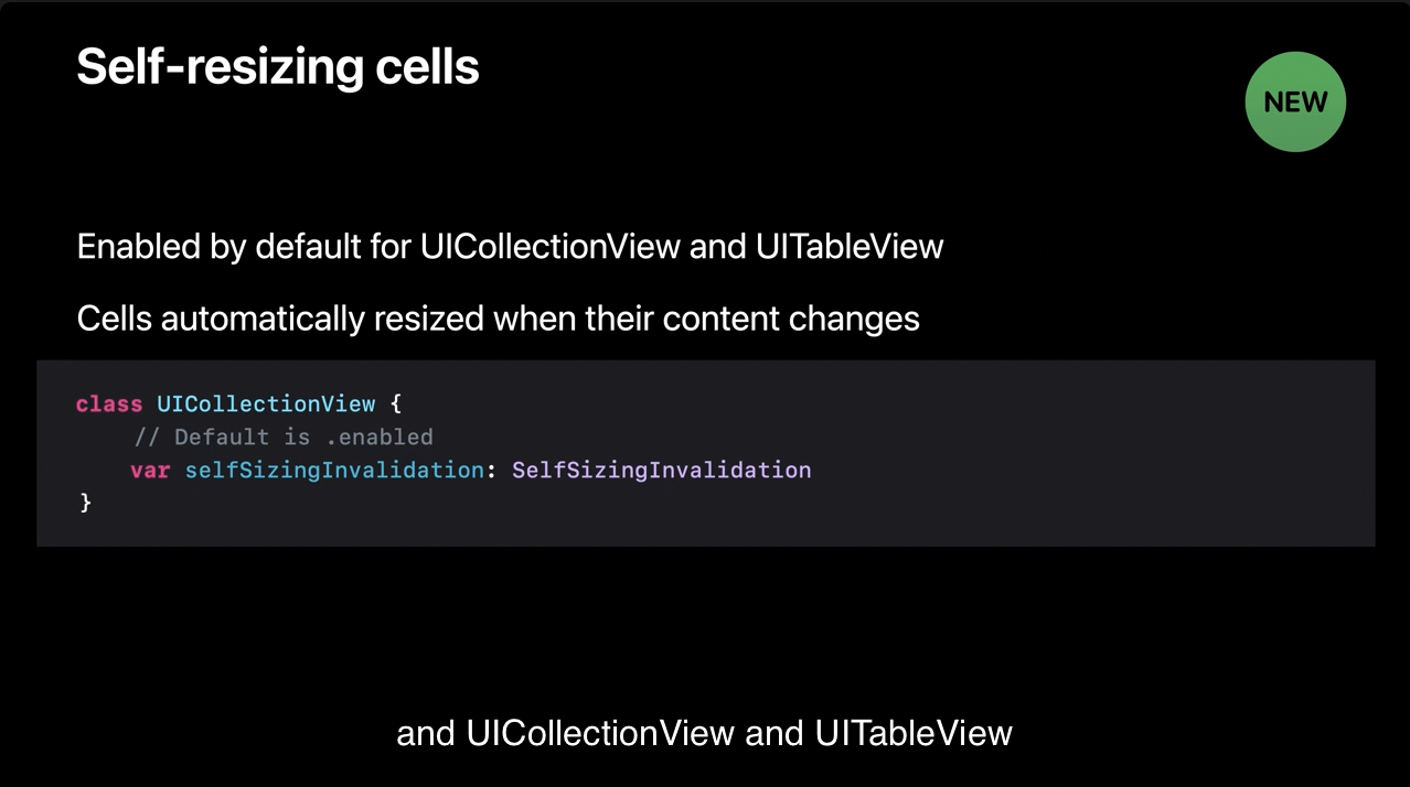
4) Self-resizing cells
UICollectionView 와 UITableView 를 위해 셀을 self resizing 것이 크게 업데이트 되었습니다. 이제 셀들이 알아서 크기를 바꿉니다! iOS 16 에서는 cell 의 콘텐츠가 변경될 때 자동으로 새로운 콘텐츠에 맞춰서 셀 크기를 조정하게 됩니다.
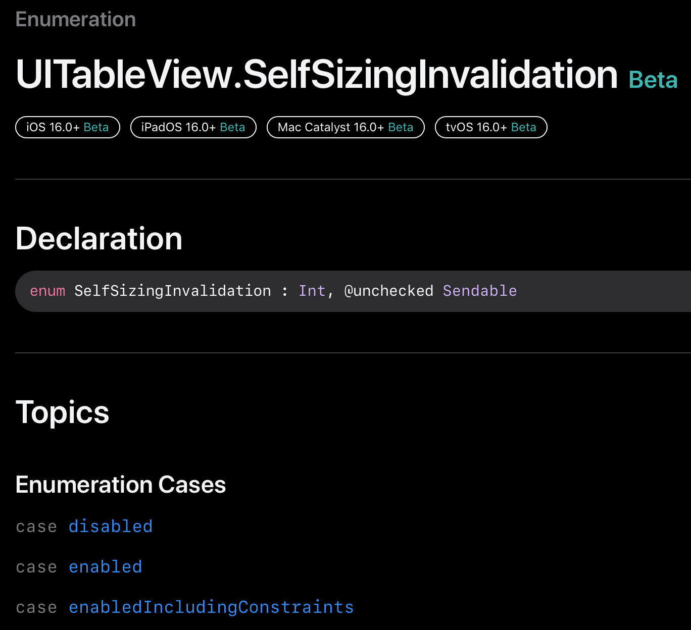
이 동작은 기본적으로 활성화 되어 있고, UICollectionView 와 UITableView 는 seflSizingInvalidation 프로퍼티가 추가되어 이 새로운 기능을 제어할 수 있게 되었습니다.
원리를 알려 드리겠습니다.
selfSizingInvalidation 이 활성화되어 있을 때 셀은 포함된 collection 또는 table view 통하여 크기 조정을 요청할 수 있습니다.
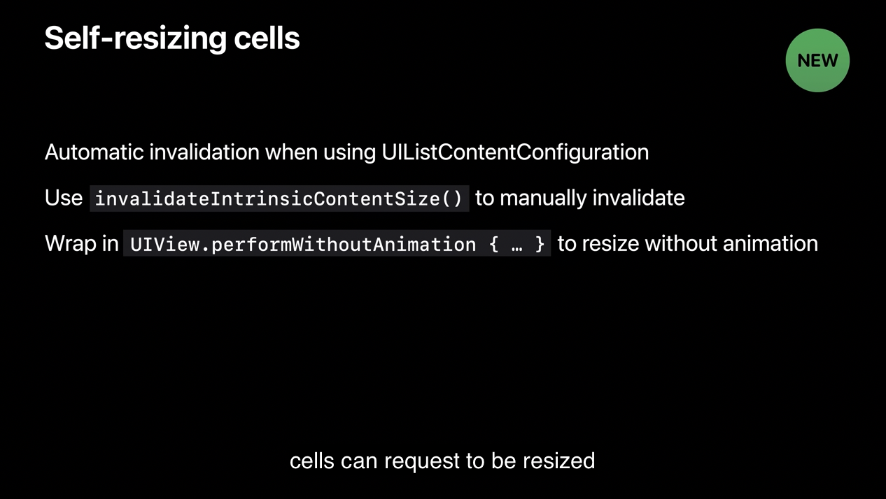
UIListContentConfiguration 으로 셀을 설정한다면, 셀의 configuration 이 바뀔 때마다 자동으로 무효처리가 됩니다.
다른 경우에는 셀이나 셀의 contentView 의 invalidateIntrinsicContentSize 메서드를 호출하여 조정할 수 있습니다.
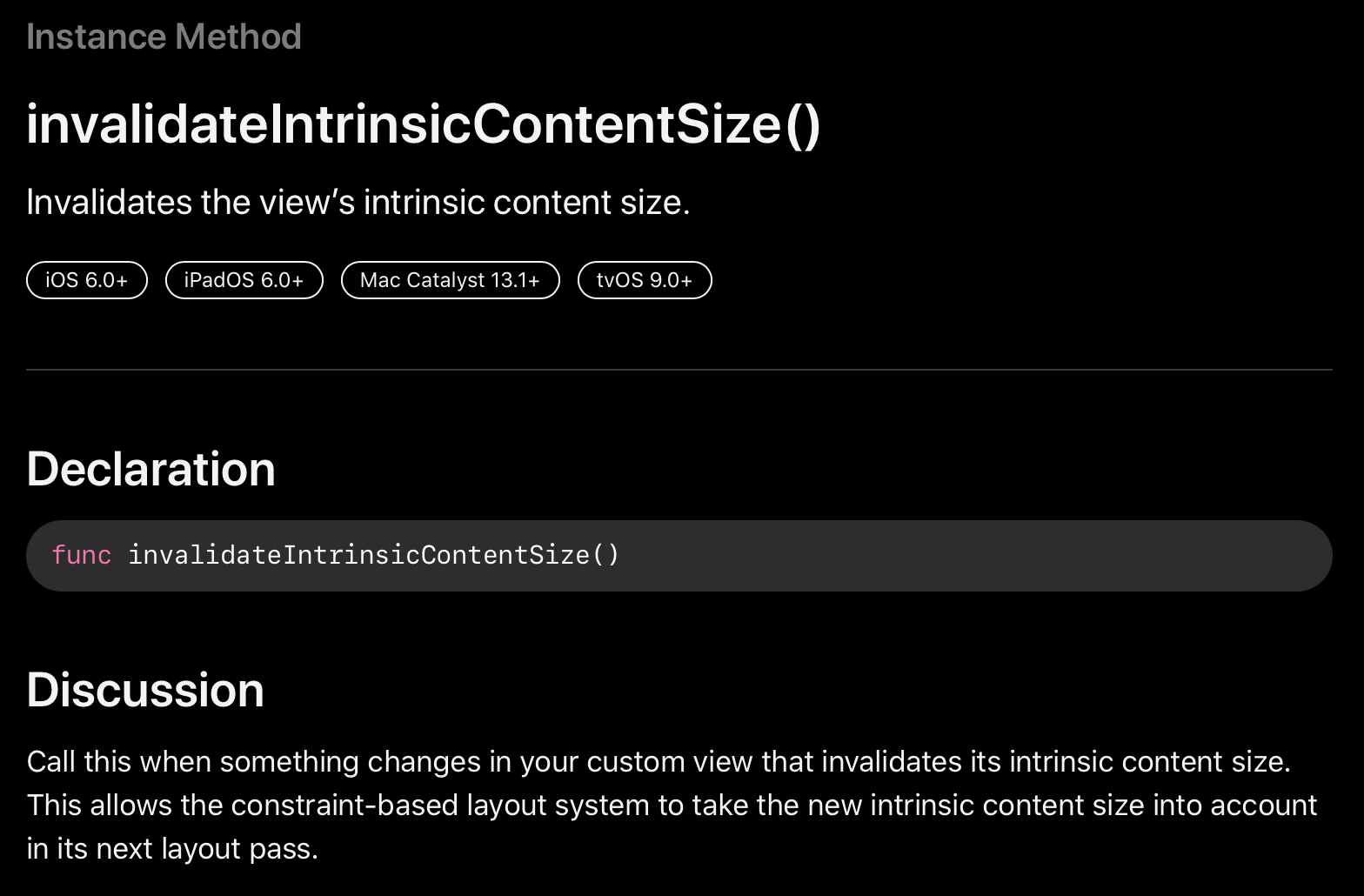
UIListContentConfiguration 의 경우는 자동으로 무효처리가 되지만 다른 경우에는 invalidateIntrinsicContentSize 를 호출하여 intrinsic content size 즉, 고유 크기를 무효화 해야 합니다. 이를 통해 constraint-based layout system 은 다음 layout pass 에서 새로운 intrinsic content size 를 가져갈 수 있습니다.
고유의 크기를 무효화하고 다음 레이아웃을 반영할 때 새로운 고유 크기를 반영하는 원리입니다.
기본적으로 cell 들은 애니메이션과 함께 resize 됩니다. 하지만, invalidateIntrinsicContentSize 를 호출하는 것을 UIView.performWithoutAnimation 블럭 안에 래핑하면 애니메이션이 나오지 않습니다.
이처럼 UICollectionView 와 UITableView 는 지능적으로 셀의 크기 무효화를 최적의 시기에 하나의 업데이트로 수행하도록 통합합니다.
만약, Auto Layout 을 셀에서 사용한다면 enabledIncludingConstraints 를 선택하므로써 더 포괄적인 행위로 옵트인 할 수 있습니다.
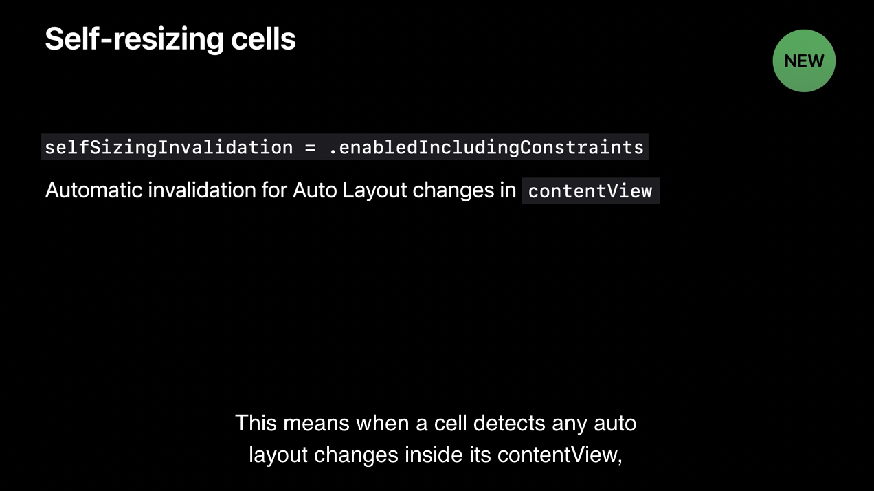
이것은 contentView 내에서 오토레이아웃의 변화를 감지할 때 자동으로 invalidateIntrinsicContentSize 를 스스로 호출하여 소속된 collection 또는 table view 가 필요에 따라 resize 할 수 있습니다.
이를 통해 아주 쉽게 콘텐츠나 레이아웃의 업데이트에 대해서 자동으로 셀의 크기를 조정할 수 있습니다.
4. UIKit and SwiftUI
UIKit 은 강력하고 유연합니다. SwiftUI 를 사용하면 UI 를 구현할 때 더 풍성하게 표현할 수 있습니다. 같은 앱에서 두 개의 프레임워크를 쉽게 적용할 수 있도록 하였습니다.
UIHostingConfiguration
iOS 16에서 SwiftUI 를 사용하여 collection 과 table veiw 를 위한 새로운 방식으로 셀을 만들 수 있습니다.
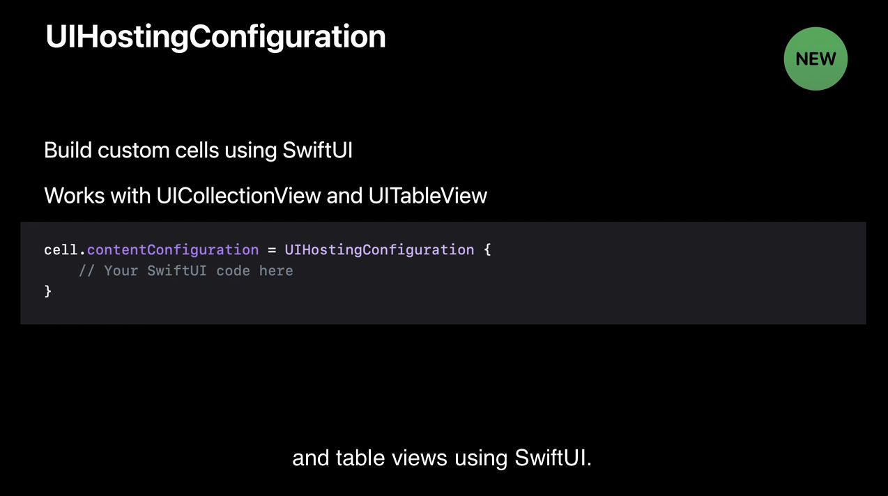
이렇게 가능하도록 하는 것은 새로운 content configuration type 인 UIHostingConfiguration 덕분입니다.
위의 코드 한 줄이면 SwiftUI 를 셀 안에서 바로 작성할 수 있습니다. 추가 뷰나 뷰 컨트롤러는 필요 없습니다.
아래는 간단한 SwiftUI 로 작성한 custom cell 입니다.
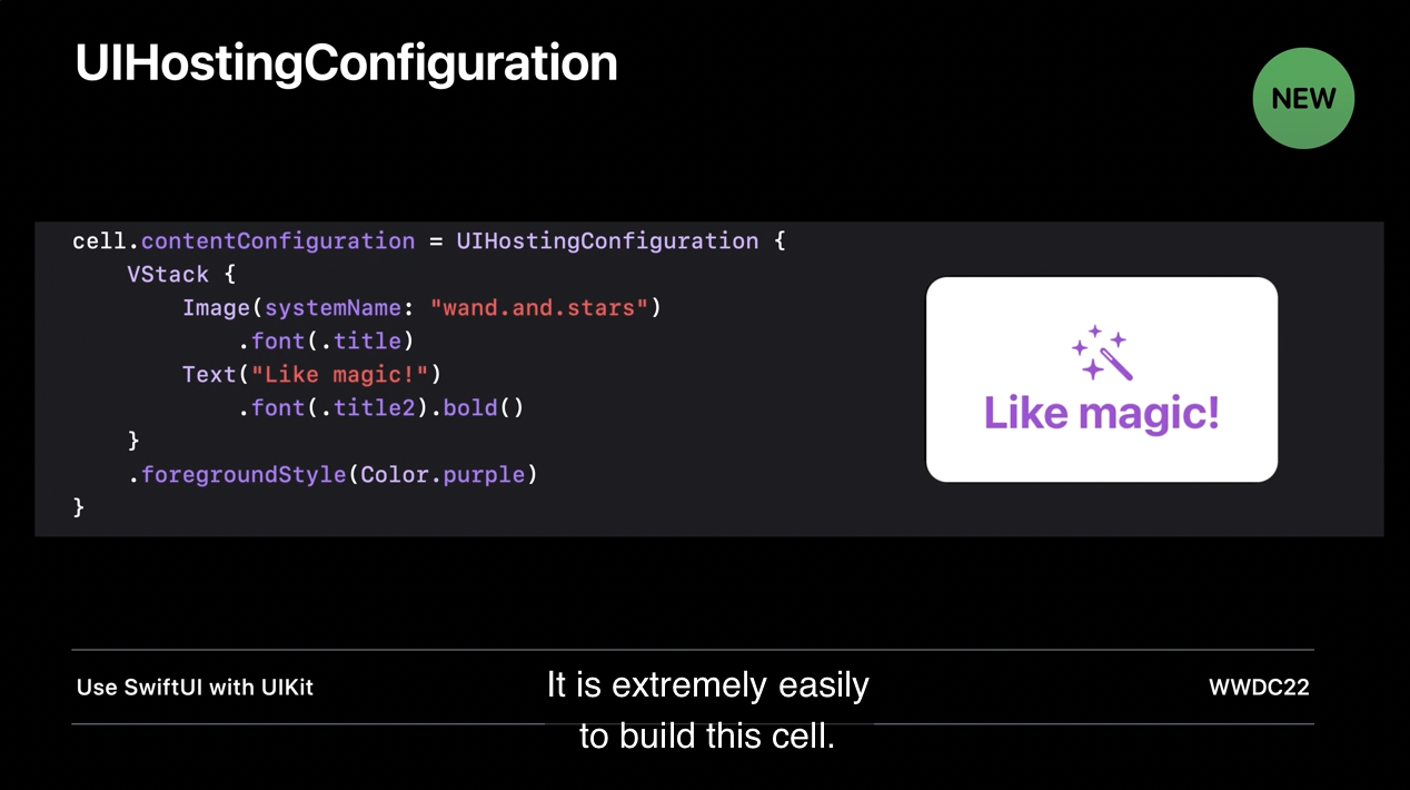
여러분들의 앱에 SwiftUI 를 통합하는 정말 멋진 방법일뿐 아니라 SwiftUI 의 풍부한 표현을 통해 UIKit 에서 커스텀 셀을 만드는 것이 무엇보다 효율적으로 되었습니다. 더 알아보고 싶다면 위의 세션을 통해 알아볼 수 있습니다.
A Couple of Smal but Important Changes
여러분들이 알둬야할 작지만 중요한 변경사항이 있습니다!
- 사용자가 추적되는 것을 방지하기 위해서
UIDevice.name은 이제 유저의 커스텀 기기 이름이 아닌 모델 이름을 반환합니다. 커스텀된 이름을 사용하기 위해서는 이제 entitlement(권한) 를 요구합니다. UIDevice.orientation설정은 이제 지원하지 않습니다. UIViewController API 인preferredInterfaceOrientation으로 인터페이스의 의도된 방향을 지정할 수 있습니다.
'WWDC' 카테고리의 다른 글
| WWDC22) Complications and widgets: Reloaded (0) | 2022.08.30 |
|---|---|
| WWDC22) What's new in App Store Connect (0) | 2022.08.01 |
| WWDC22) What's new in the Photos picker (2) | 2022.07.12 |
| WWDC22) Design protocol interfaces in Swift (0) | 2022.06.21 |
| WWDC22) Embrace Swift generics (0) | 2022.06.18 |
- watchOS
- 서버통신
- MOYA
- async/await
- APNS
- YPImagePicker
- RxCocoa
- rxswift
- Swift
- SwiftUI
- OpenSourceLibrary
- github
- MVVM
- WWDC
- Protocol
- Firebase
- UserDefaults
- Objective-C
- Widget
- Algorithm
- WidgetKit
- projectsetting
- 2022 KAKAO TECH INTERNSHIP
- configurable widget
- Notification
- urlsession
- IOS
- containerBackground
- CloneCoding
- WWDC22
| 일 | 월 | 화 | 수 | 목 | 금 | 토 |
|---|---|---|---|---|---|---|
| 1 | 2 | |||||
| 3 | 4 | 5 | 6 | 7 | 8 | 9 |
| 10 | 11 | 12 | 13 | 14 | 15 | 16 |
| 17 | 18 | 19 | 20 | 21 | 22 | 23 |
| 24 | 25 | 26 | 27 | 28 | 29 | 30 |
| 31 |
- Total
- Today
- Yesterday